An Updated Brand Drives New Life into this Aging Automobile Company

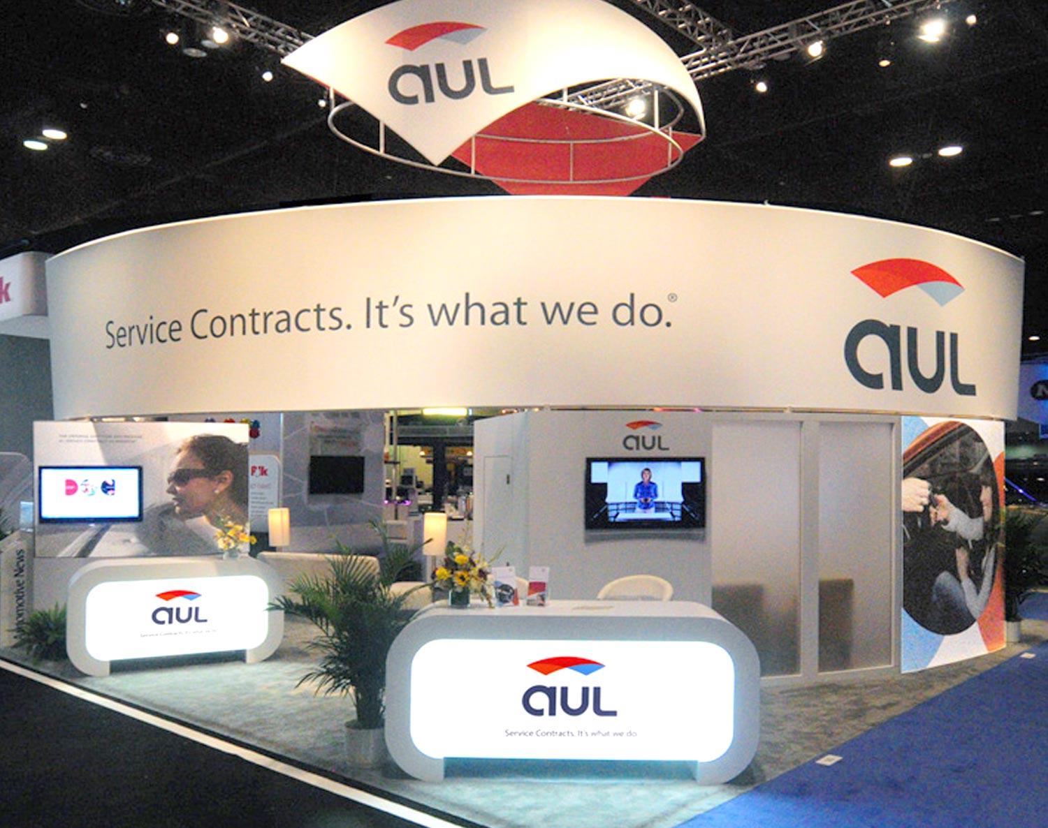
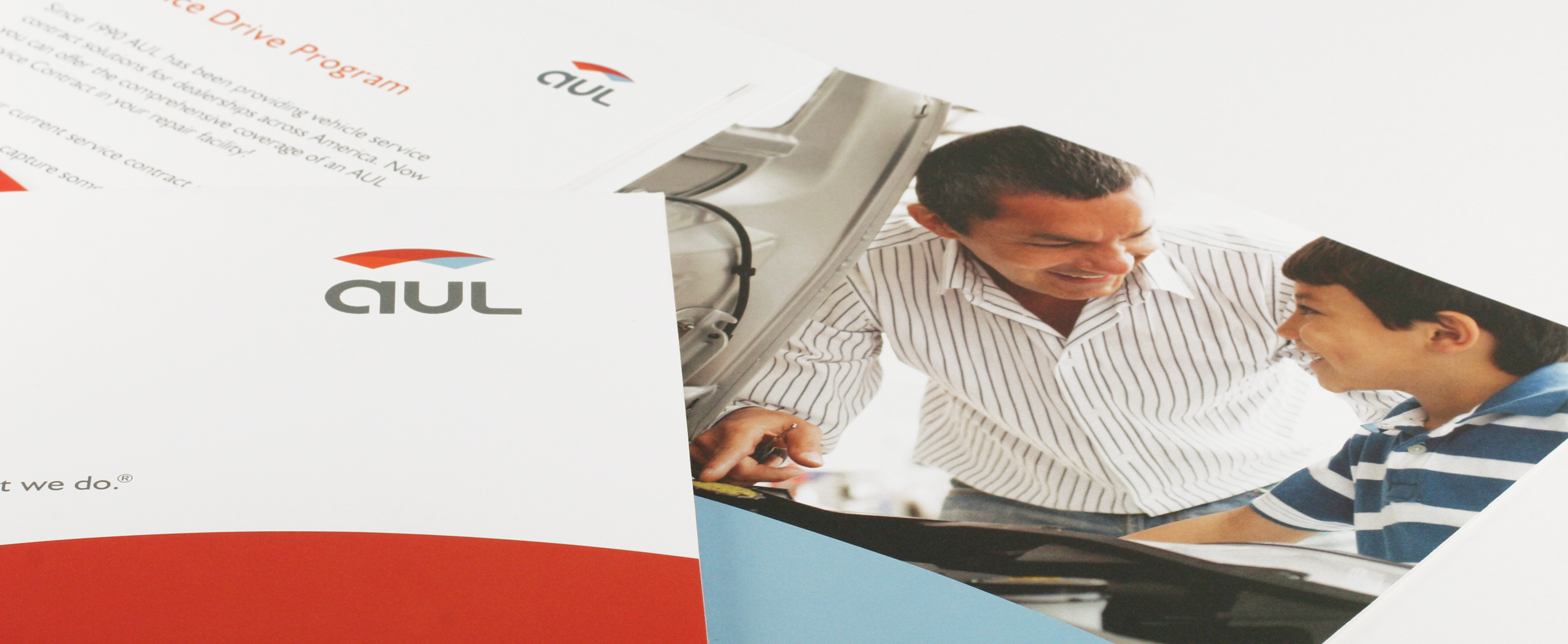
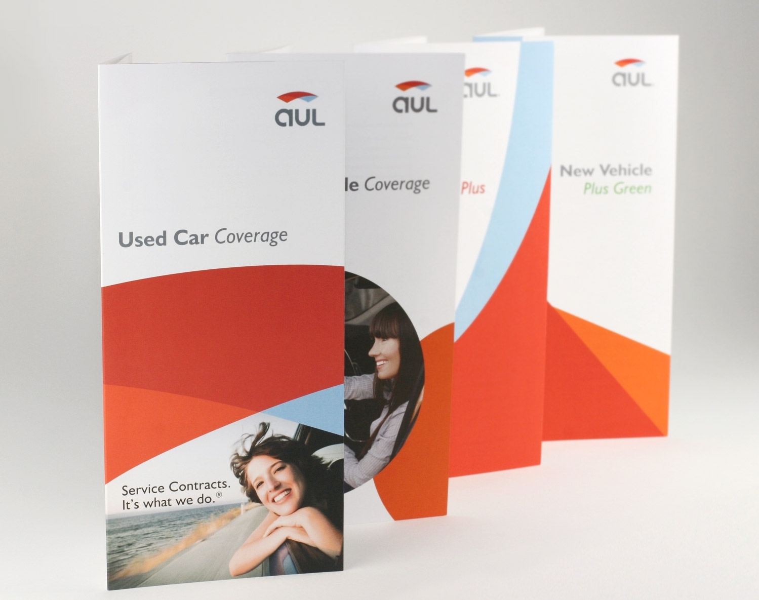
Rebranding of this automobile insurance contract company, Project6 redesigned their brand identity, marketing collateral, trade show booth, and website.
—Jacqueline Swank, Marketing Manager
Updating the Weathered Brand
The old brand and messaging did not clearly communicate who AUL was or what they stood for. They needed to realign as a leader in their industry, bring a stronger human element to the collateral, and create effective marketing tools for the sales team. Their agents and auto dealers also were requesting improvements to the products, processes and collateral.
Brand Strategy + Interviews
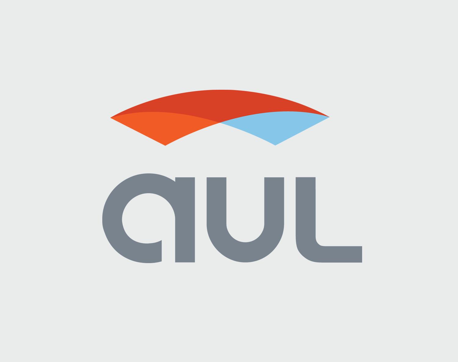
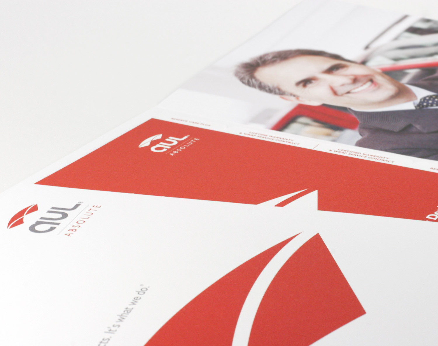
After an in-depth strategic brand analysis, Project6 found there were several areas of the brand and materials that could be changed to better reflect the essence of AUL. The new logo and identity were inspired by the human element and unique culture AUL has built over the last 22 years of business. The attributes of this new brand include friendliness, approachability, protection, and meaningful relationships. The new AUL logo has a more approachable font, along with a new mark that includes three new colors that represent transparency and protection, important aspects of AUL.
The New Brand Identity
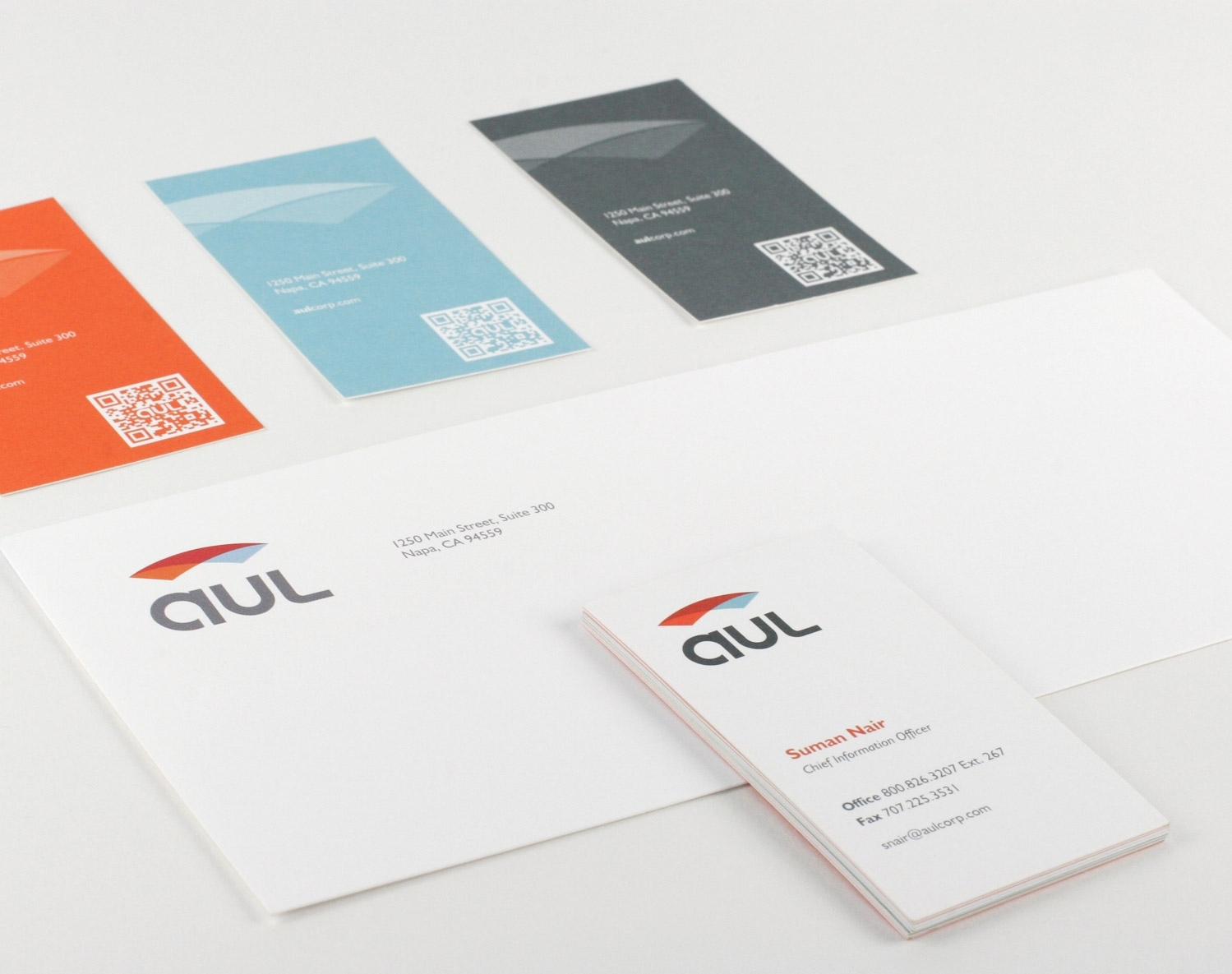
We brought a strong human element to the logo and identity to reflect the approachability of the company and its culture. This human element was created by using a friendly lower case font for ‘AUL’ and a ‘parafoil’ as an abstract representation of the protection the company provides its customers. The new identity more accurately captures AUL’s true brand character and its position as the leader in the industry. The brand consistency is achieved with a fun and flexible identity that is used across all marketing collateral pieces.
—Luis Nieves, Founder and CEO, AUL“AUL has always demonstrated the commitment to innovation and change. We believe that the new branding better reflects our business approach and culture as we grow our business.”

