Building a New Brand for a San Francisco Construction Giant

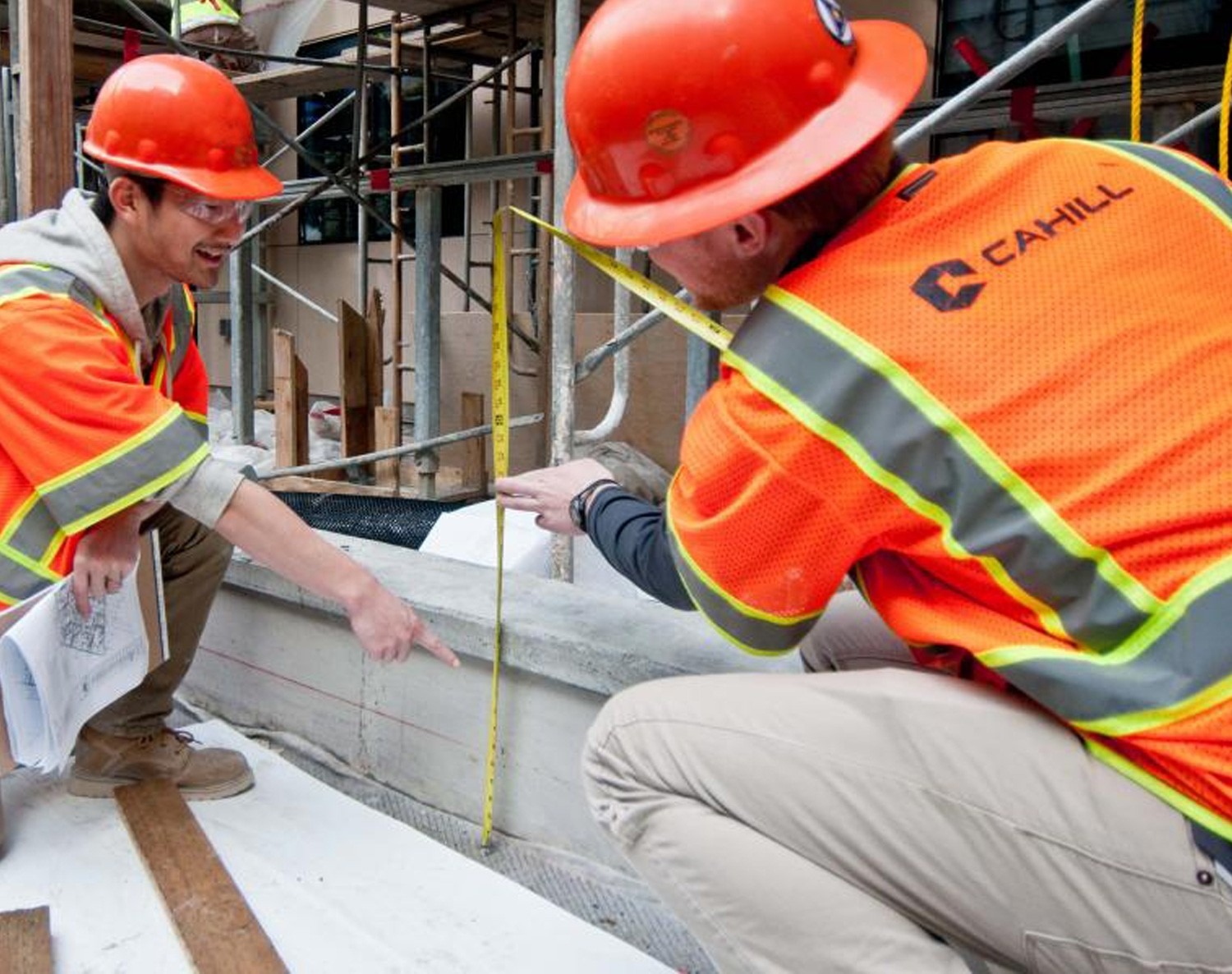
Cahill Contractors, Inc. is a Bay Area construction firm with experience across many industries around San Francisco and all sides of the Bay. Cahill prides itself on professionalism, collaboration, and value, as well as its 100-year history of exceptional quality.


Outdated and Lacking Focus
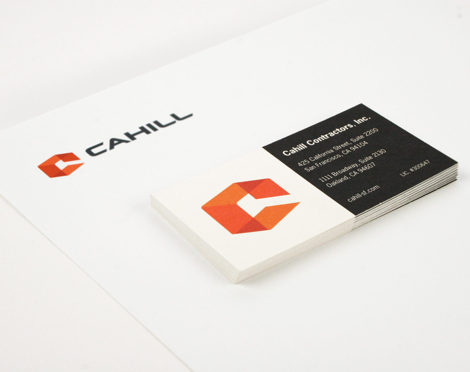
Cahill Contractors approached Project6 because their marketing materials were outdated and lacked visual focus. They had been in business 100 years and wanted to retain some level of brand continuity, but their logo design was difficult to understand, they employed far too many type styles, their website layout was cluttered, and their black and white construction images was not doing justice to Cahill’s impressive work.
Rebranding with Stakeholders
Project6 helped step Cahill stakeholders through a rebranding process to determine which elements of the existing, long-standing branding to retain — and which to refresh. The website architecture needed to be simplified to focus site visitors on Cahill’s main selling point, beautiful images of their work across many different industries, and better highlight their client relationships.
Bold and Unified
—Rachel Short, Marketing Manager, Cahill Contractors“Project6 was a dynamic involved partner with Cahill Contractors during our rebranding. They took time to understand the brand and our 100+ year old family owned company history and culture. Their logo design and website redesign took into account our desire to self-manage it and update it and stayed within our budget. They delivered on-time and I would highly recommend them to anyone looking for rebranding or website design.”


