A New Brand Galvanizes the Community for Belvedere-Tiburon

The Belvedere Tiburon Library, located just north of San Francisco, has patrons in the cities of both Belvedere and Tiburon. The library also has its own foundation, The Belvedere Tiburon Library Foundation, to galvanize the community in support of library development.

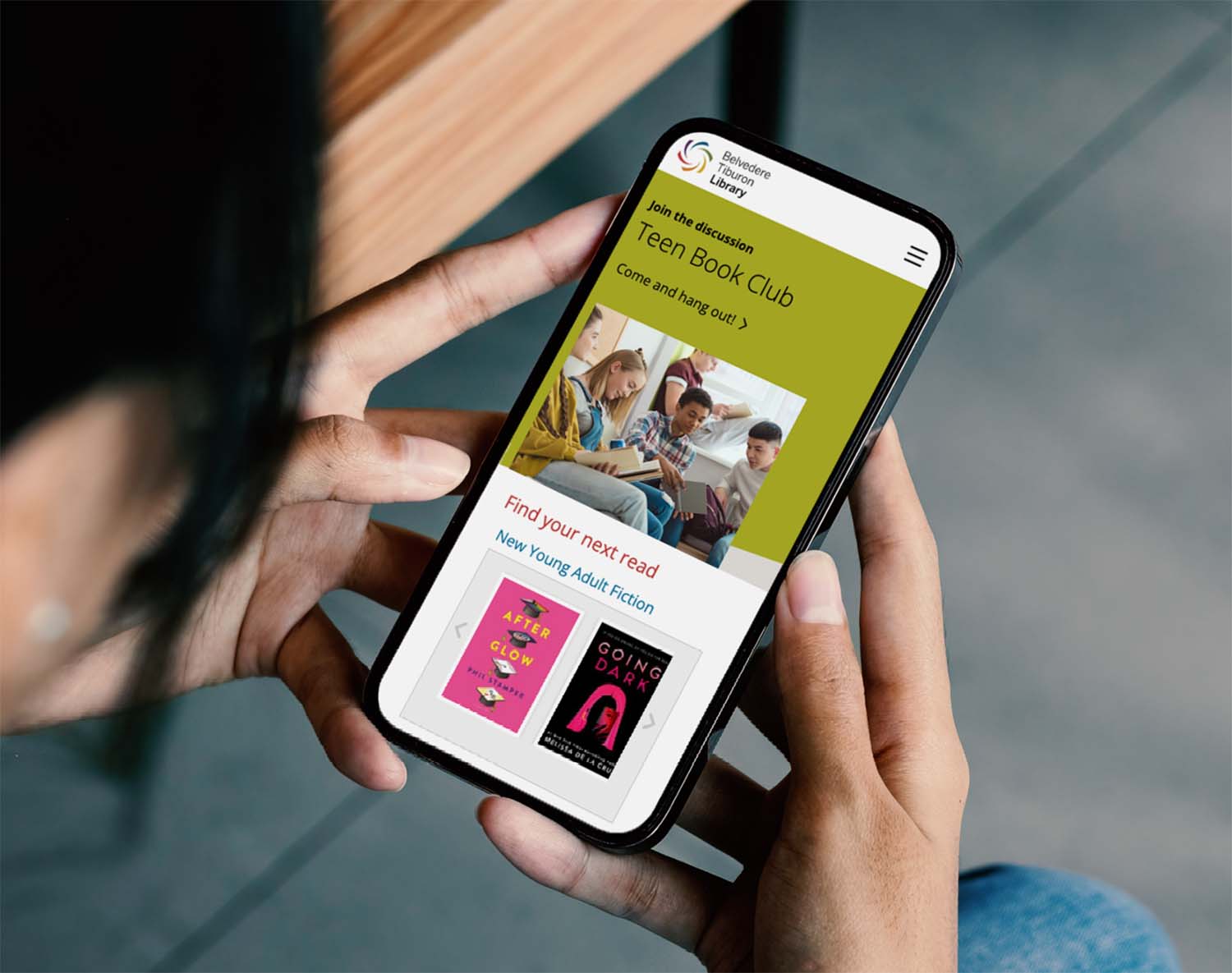

Brand Identity and Website Redesign
When the library approached Project6 to work on both a brand identity and website redesign, its website was significantly dated. The website lacked organization, consistency and clarity. Pages contained a confusing variety of section designs, logos and other graphic elements that were visually inconsistent. The palette was muted and dull and lacked energy and freshness. The logo mark was a somewhat abstract geometric mark meant to reflect the location’s presence as a sailing destination by the Bay.
Establishing a Brand
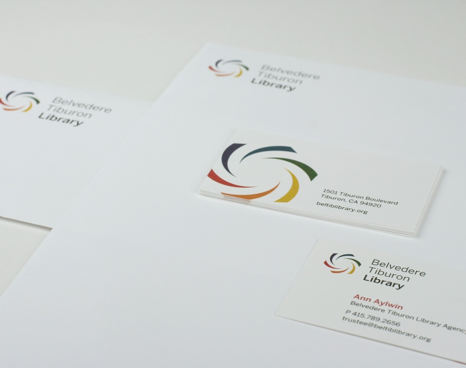
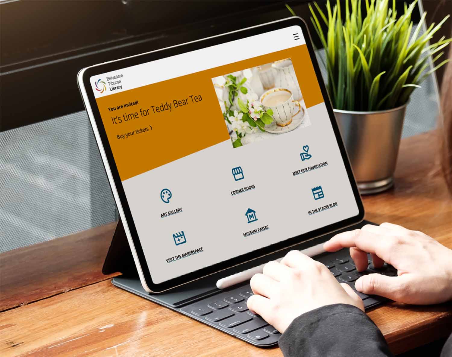
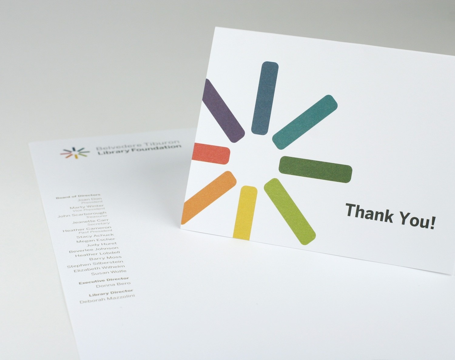
Project6 first worked with the library team to establish their new brand mark, color palette, and stationery system. The freshly designed logo is bright, clean and upbeat, appealing to a wide variety of viewers. After surveying many library websites, Project6 helped the library to organize their website information in an intuitive way—as well as a way that was easy for library admins to maintain.
A Positive User Experience
As part of the design process, Project6 also developed the branding and website of the Foundation. At the time of the project, the Foundation was also in the process of raising funds for new library growth, and needed a significant online presence. The outcome was two “conjoined” websites, using the same design templates, palette, and content management system to make maintenance easy for admins, but a distinct and separate online presence for visitors, with two different urls, logos and architectures. Both websites offer a positive user experience that is warm, accessible, and intuitive.
—Deborah Mazzolini, Belvedere Tiburon Library“Everyone at Project6 listened to our ideas, understood our goals, and then turned our vision into a beautiful, functional, and usable site. It is a world class website and is praised and appreciated by other libraries and organizations. Our librarians are very proud of what was accomplished and our library users now have an incredible resource. On top of that, the project came in on budget and in a timely manner.”


