San Francisco Web Design Agency in the News

Design Made Simple
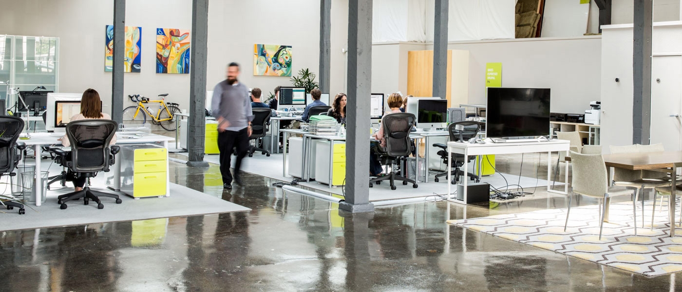
A newly renovated studio space showcases the Project6 philosophy of design: simplicity and cleanliness with an eye toward longevity.
By Clay Hamilton
Photography by Aubrie Pick
Project6 Design is an award-winning Bay Area graphic design agency committed to shaping brands and solving complex usability problems with intuitive design.
The company was co-founded in 2001 by Edina Tanović and Esten Sesto. And why the name Project6? “Esten’s last name means sixth in Italian, which became a kind of fun thing for us, like a James Bond–sounding secret mission,” says Tanović.
Originally they both worked in product design, but over the years, working in different agencies, she became more interested in branding and graphics while he focused on UI/UX. Today, Project6 offers a wide variety of expertise in brand, print and Web projects for clients such as eBay, Old Navy, Pottery Barn and Gap.
“One of the unique aspects of our firm, of our size, is we do the branding, print, and Web and everything in between in-house, so there is a really consistent marketing message,” says Sesto. “We’re constantly collaborating in our office,” Tanović adds. “We look at how to push a design as far as we can while respecting what it needs—how it works—across different communication channels and using different media.”
When they first saw their new studio space, formerly a desktop printer repair facility, it looked like a setting from the show Hoarders. But Tanović and Sesto recognized the potential. And they were bursting at the seams in their former studio—the new space would double their room. “So we did a lot of work and did all this demo, and at some point I said, ‘OK, we have to stop. We have to move in and figure out how to use this space,’” says Tanović.
Though there are still modifications they are thinking of making, the new space has been transformed to meet their needs very well.
1
Project6 finished renovations of the new studio and moved in last October. The expanded space allowed the company to increase its staff (without having to put them in the kitchen).
2
The space originally had a second floor with the windows painted over. The floor was taken out and the area opened up to provide an expansive, welcoming feel.
3
Project6’s philosophy of design is about simplicity and cleanliness. But at the same time, it’s classic. Nothing is trendy. Tanović wanted everything in the studio to be there for ten years and not just for six months, so the choices that were made were about longevity and classic elements.
4
The ramp is a leftover from the building’s former days, but the current employees use it to good advantage.


