—Al Martinez, Communications Director, Family Caregiver Alliance
PROBLEM
Organizing the Library
The FCA’s content-intensive website could feel overwhelming, with a navigation structure that was anything but user friendly. Its search feature was cumbersome, which prevented important information from being found, and the ability to update content was equally daunting. Although the site saw a relatively high rate of traffic, the duration of page engagement and the number of return visits needed improvement. Print collateral was also outdated and inconsistent.
SOLUTION
Compassion in the Details
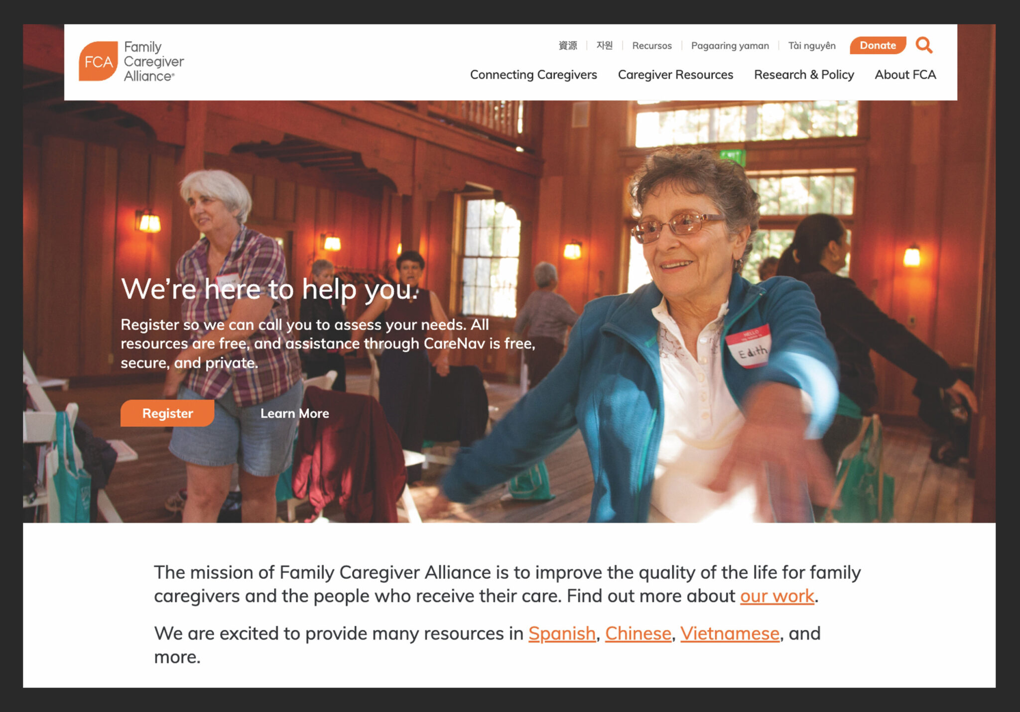
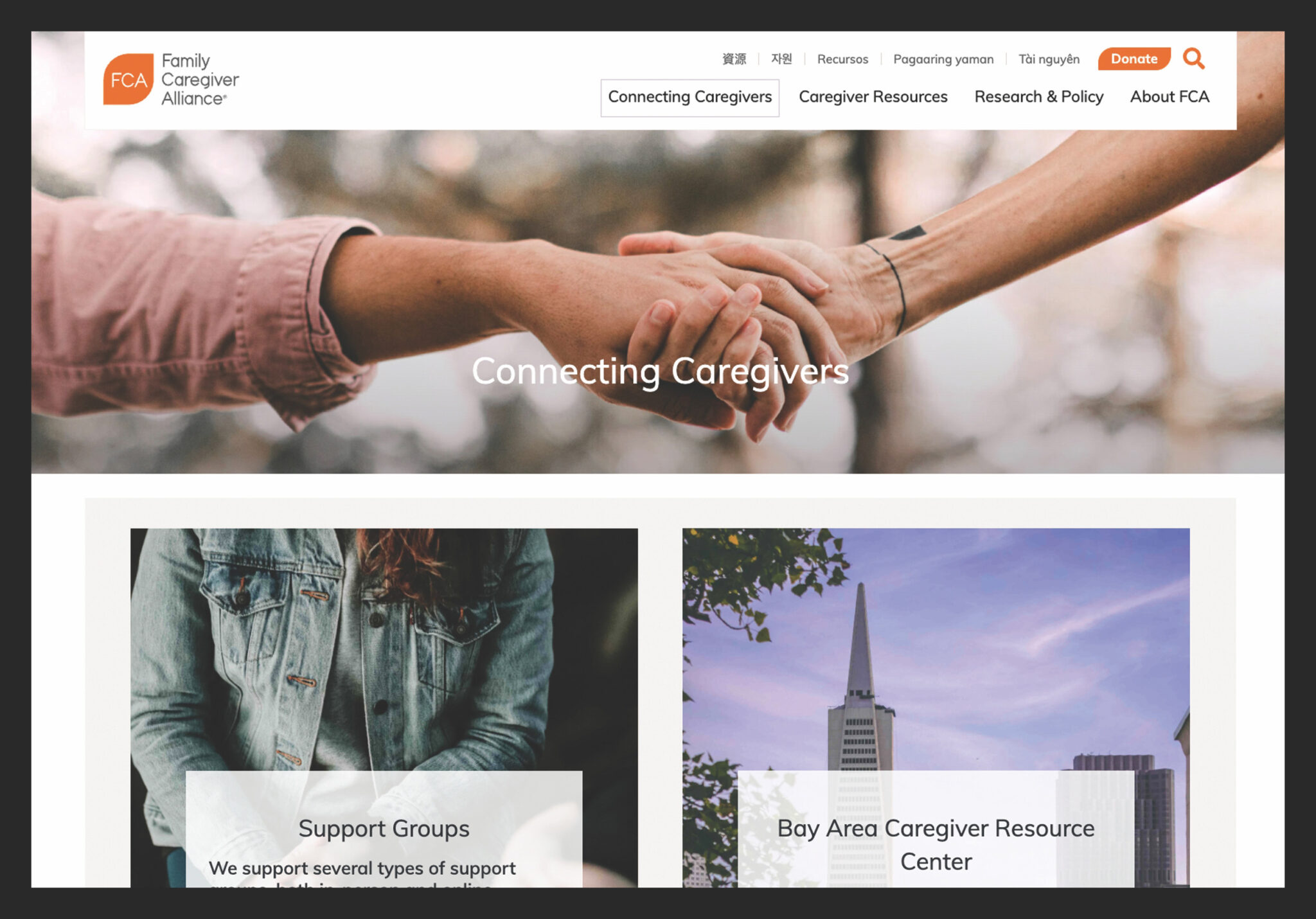
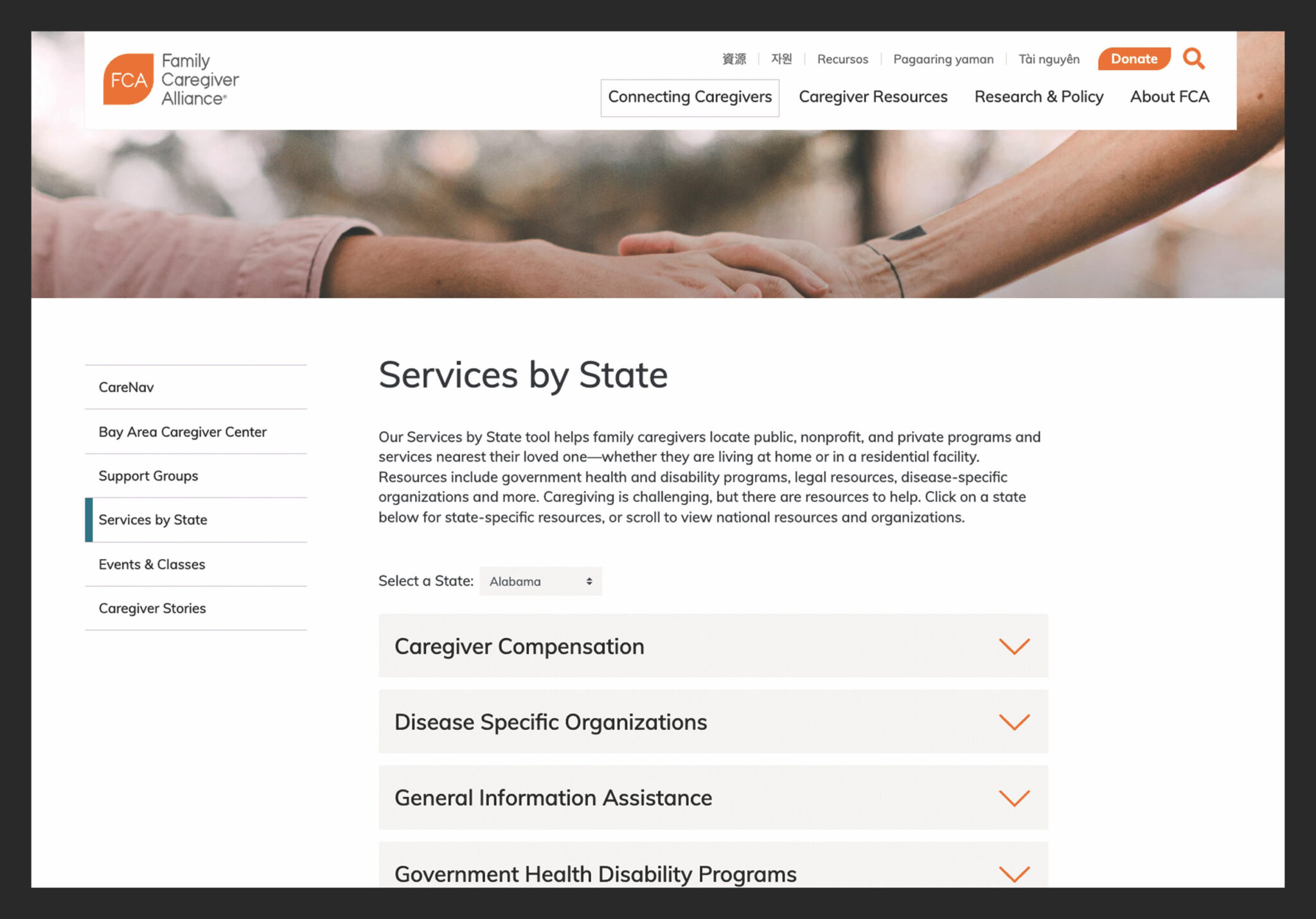
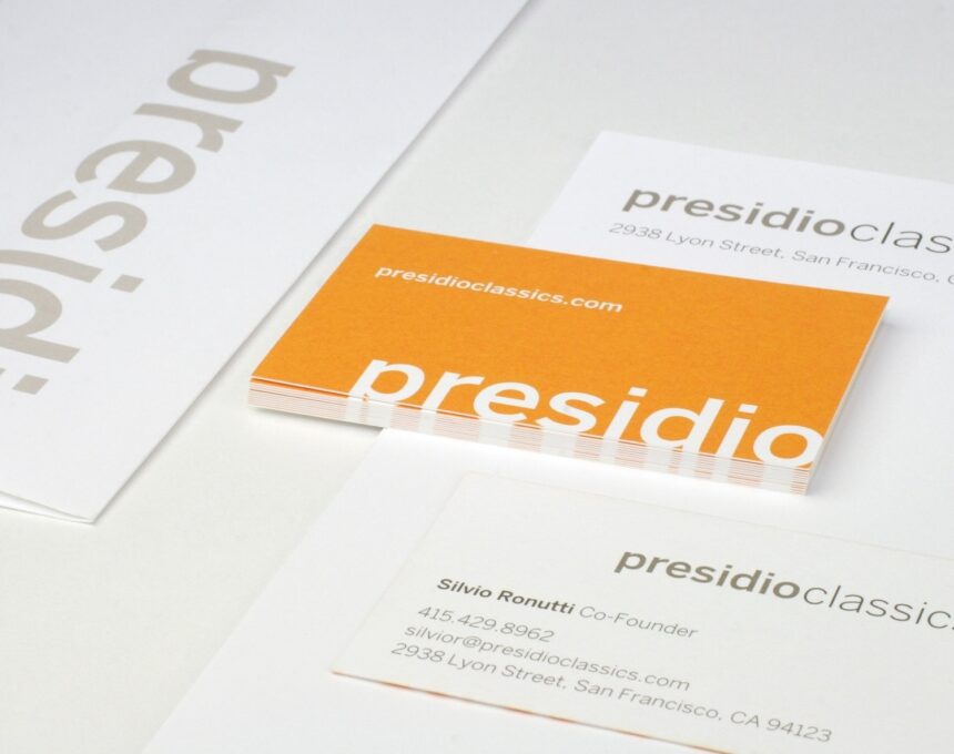
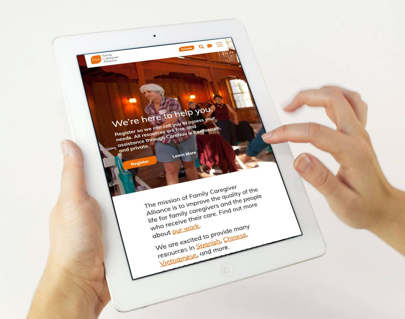
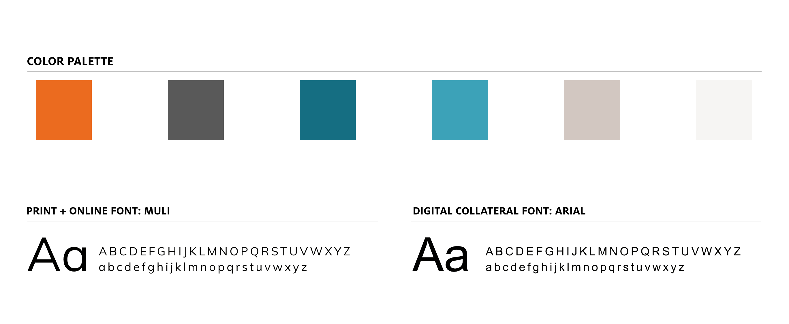
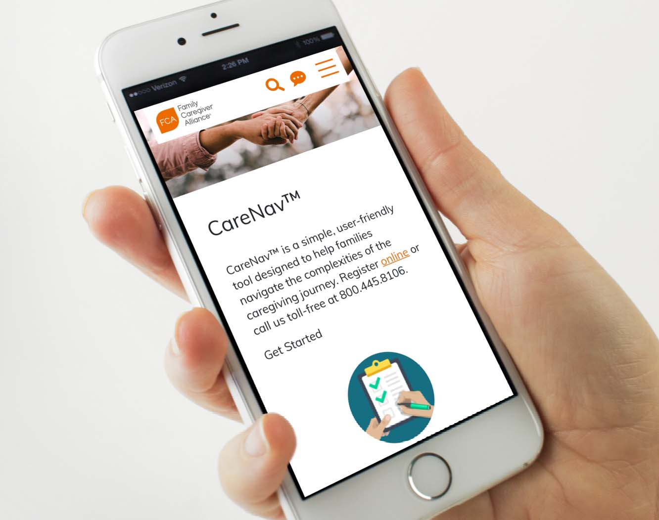
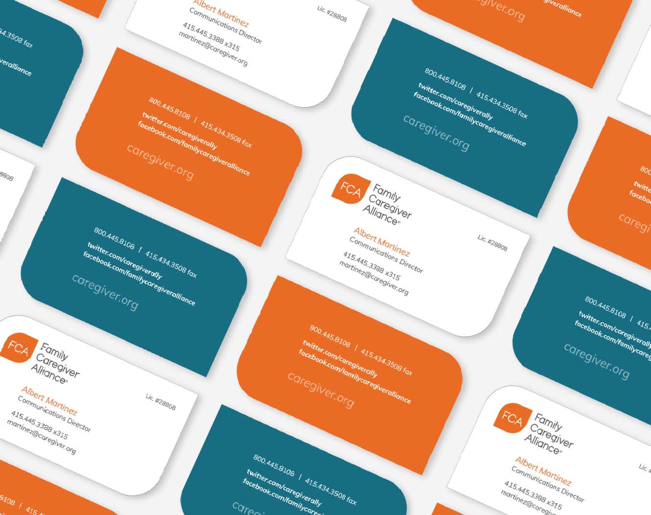
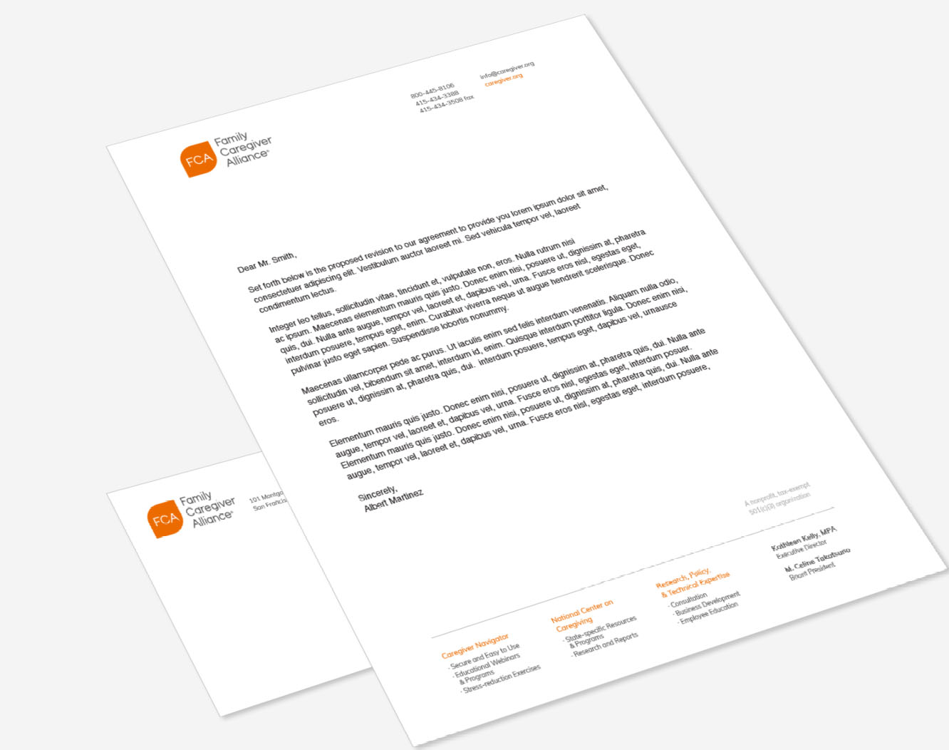
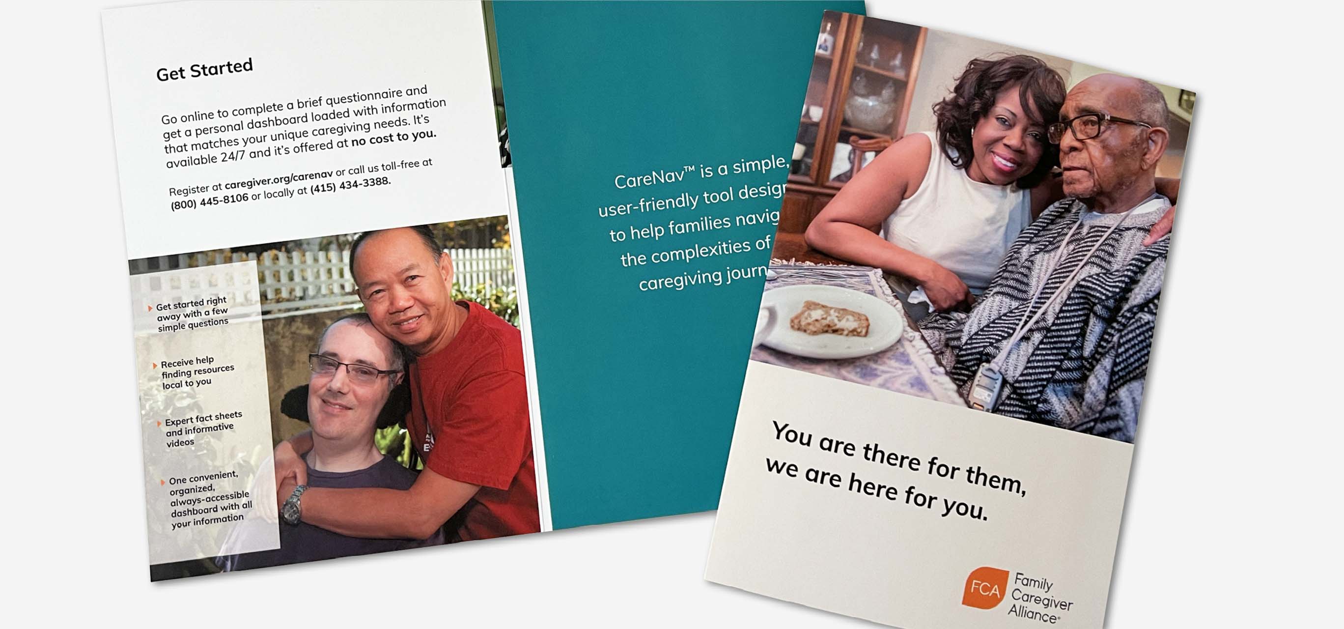
Our approach centered around making caregivers feel welcome and supported, while offering industry experts more direct access to tailored content. We designed a new website with intuitive functionality, including a simplified search of hundreds of resources, events, articles and stories—which were also meticulously reorganized. More than a dozen modular block designs were created so content managers could modify page layouts to their individual needs. A new logo and revamped print collateral rounded out the brand refresh with a modernized look.
RESULT
An Inviting Web and Brand Presence
From families to policy makers, visitors to the FCA website can now quickly access content that’s right for them. The extensive library of information feels approachable, easily searchable, and includes resources delivered in five languages to accommodate a broad audience. Our new user-friendly design has encouraged more caregivers to use the site as their primary information source. Overall, a unified brand experience across all touchpoints helps support the FCA’s mission to be there for caregivers—making a challenging situation that much easier.
Supporting nonprofits and foundations with their brand identity continues to be a passion for the Project6 team.
