A Boutique General Agency Builds Trust With an Updated Brand

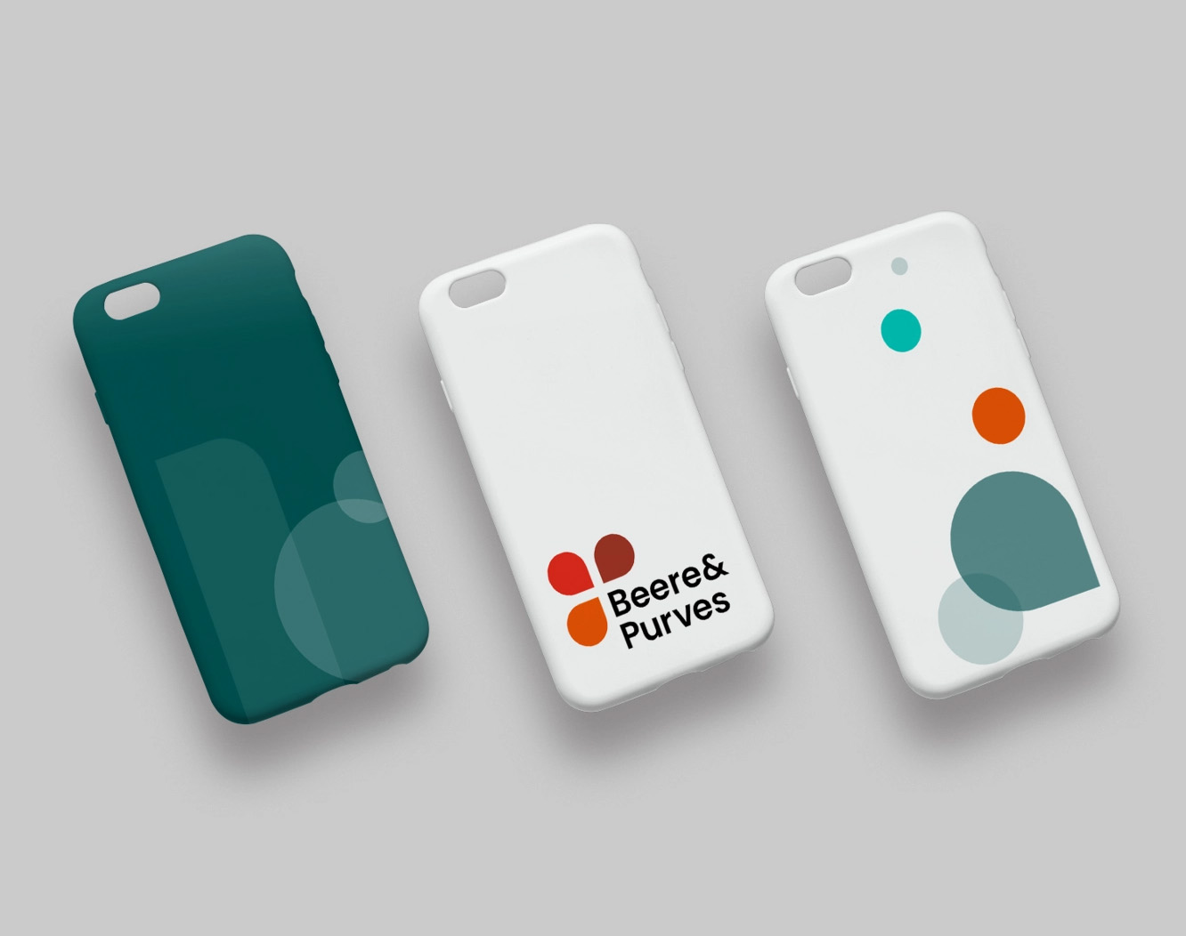
Beere & Purves provides traditional insurance sales support for brokers and agents of all sizes by offering quality products, services, tools, and customer support. They provide a one-stop shop for tools and resources that help brokers sell and service their group clients. Beere & Purves approached Project6 to redesign their brand identity and their website.

Outdated & Over-Complicated
The Beere & Purves brand and website felt dated: its logo, palette, images and graphics felt stodgy, while its competitors’ sites were much more modern. Already a complex topic, page layouts made the subject matter even harder to understand, and resources difficult to find. Logging in to access gated content sent users jumping through unneeded hoops.
Refresh & Refine
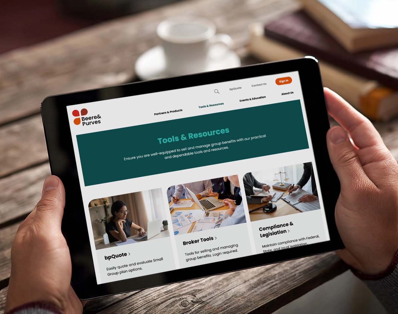
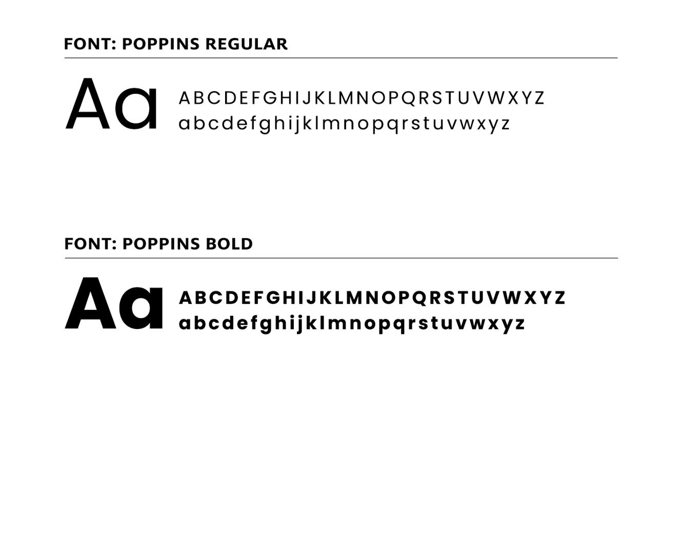
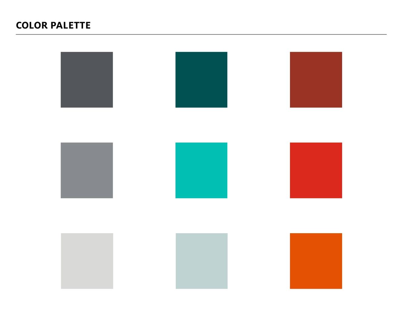
Small but significant shifts to simplify the website architecture made it more intuitive for visitors to find the resources they needed. Simplifying the authentication process helped users to get to the content they needed more quickly. And a bold and unexpected new brand palette helped Beere & Purves stand out from the crowd.
Modern & Professional
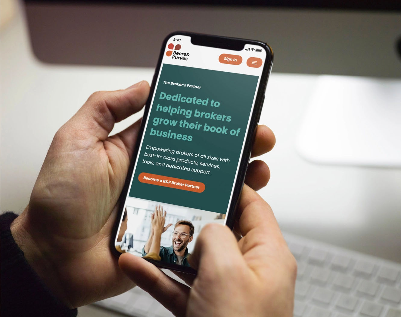
The resulting website design positions Beere & Purves as a leader in its industry. Users can now access the information they need quickly in a much more intuitive manner. The new website feels clean and uncluttered, with the brand bringing sophistication and vibrancy to the design elements across desktop, tablet, and phone.
Could we be a good fit for your brand identity project? Reach out to discuss how we can assist your team.
—Cole Seeger, Marketing Director, Beere & PurvesOur experience with Project6 throughout the entire process has been outstanding. Esten, Christine, Edina and the team have all been very responsive, professional, and helpful, making this project very enjoyable. They evaluated our current identity, conducted a thorough competitor analysis, and presented us with logo and branding options that truly set us apart. For our website, they went beyond aesthetics, analyzing traffic and ensuring a user-friendly layout. We’re excited about the launch of our revamped brand and website and couldn’t be happier with the results. We would definitely recommend Project6 to others.
