UI/UX Design for National Nonprofit Helps Users Decode Medicare and Medicaid Options
Multilingual guided questionnaire helps medicare + medicaid recipients learn about choices available to maximize their health coverage.


Using UI/UX Design to Navigate Complex Health Care Choices
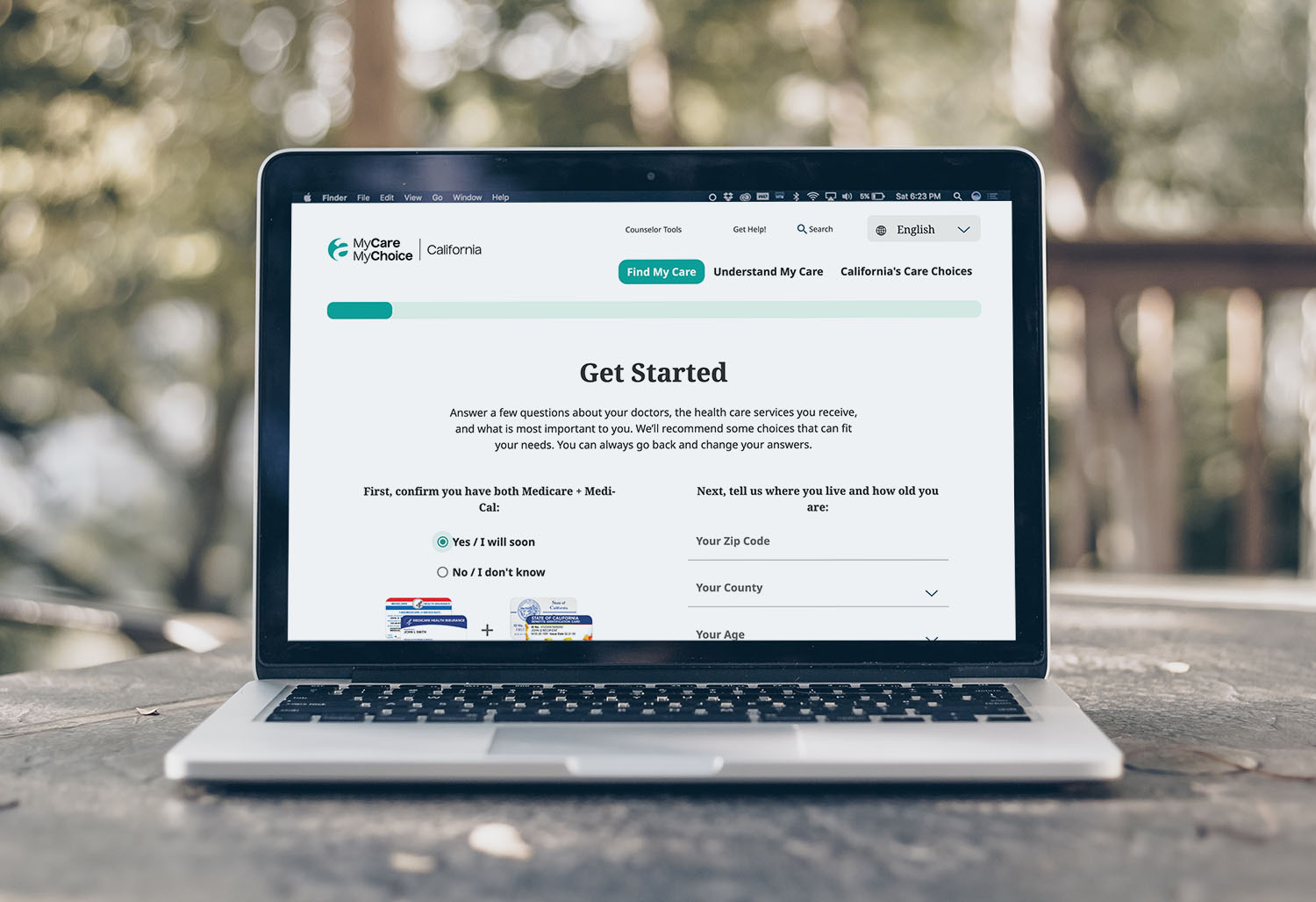
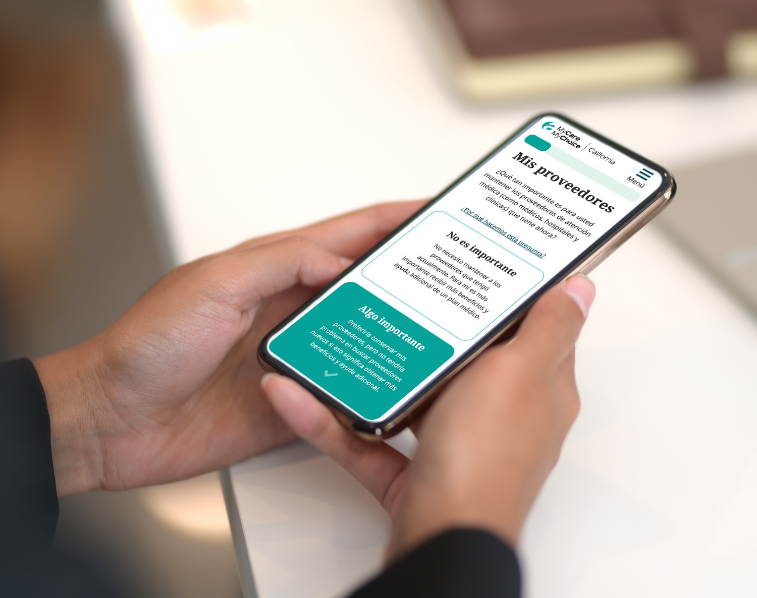
To help dual eligibles navigate the complex health care choices available to them, the MyCareMyChoice.org website presents visitors with a questionnaire. Based on their answers, the site displays a list of health care models that best meet their needs. Visitors can then learn more about how that model works, and enter their ZIP Code to learn if any health care plans of that type are available in their area.
Website Design Includes Multilingual Resources
In 2021, the site included models and plans in California and Ohio. In 2022 the site was expanded to included models and plans in Michigan. The website includes downloadable resources such as checklists, worksheets, and helpful instructions. Both the site and print materials are translated into multiple languages in each state, among them Spanish, Chinese, and Arabic. Each year, the site is refreshed with up-to-date data provided by the government. Our work with NCOA continues—two more states will be added in the coming years.


