Helping a Network of Physicians Offer Patients the Care They Deserve

Hill Physicians Medical Group is the largest network of independent doctors in Northern California. Its 4,000+ primary care physicians and specialists provide high-quality care across the San Francisco Bay, Sacramento and Central Valley areas to over a quarter million members.
They provide innovative services, systems and processes within a virtually integrated system to enable timely, cost-effective, quality care that engages patients as active, informed participants in their own health.




—Gail Basaraba, Digital Product Manager, Hill Physicians“Project6 is the best web design agency I have worked with in my 22 years in digital marketing and website management. And CONGRATULATIONS on 21 years! Highly recommended.”
Outdated & Complicated
The Hill Physicians website offered acceptable content—however, built in Sharepoint, the site layout was inflexible and pages were extremely difficult to update. As a result, site navigation was convoluted and pages were outdated. A crucial tool—an advanced physician search that enabled members and potential members to find doctors within the network—did not address important user needs. In addition, the Hill brand looked tired and inconsistently applied across the site. Project6 needed to work within strict constraints to build a site that balanced a flexible design with Hill’s strict security requirements to offer discerning potential consumers a fresh, supportive, and informative experience.
A Modern Build
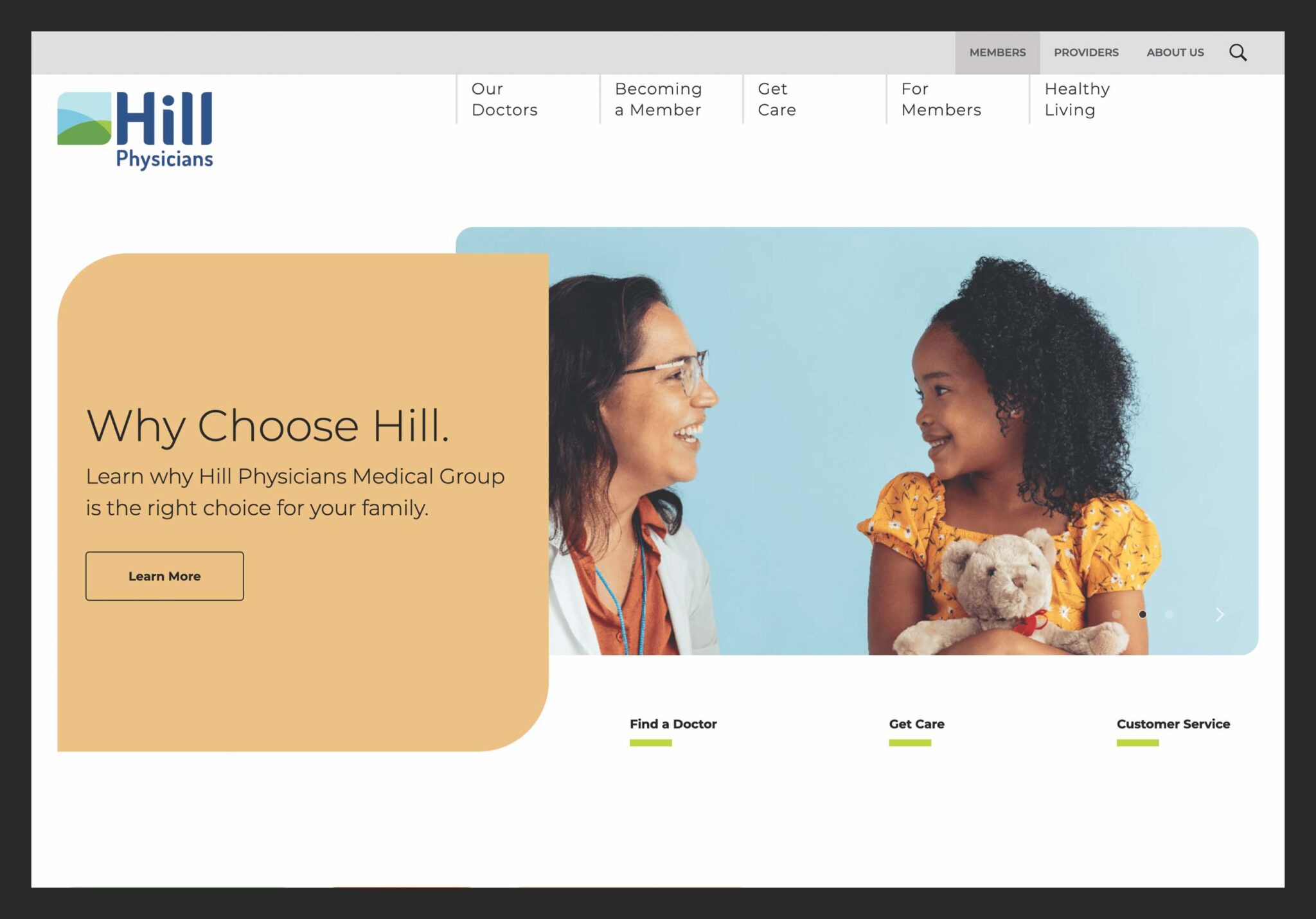
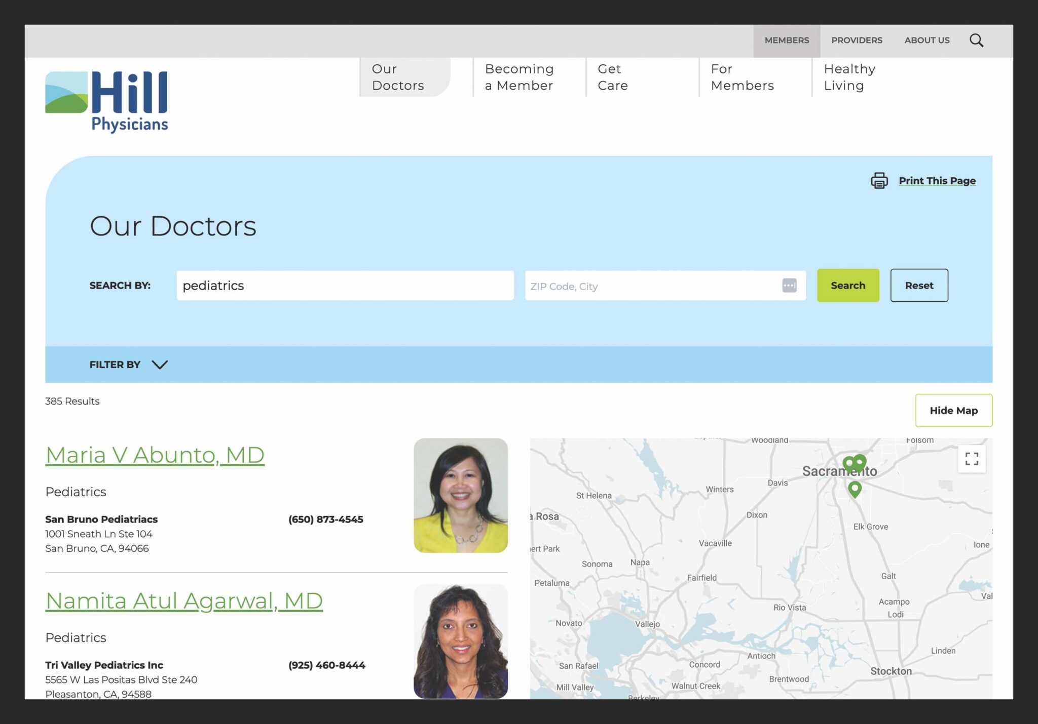
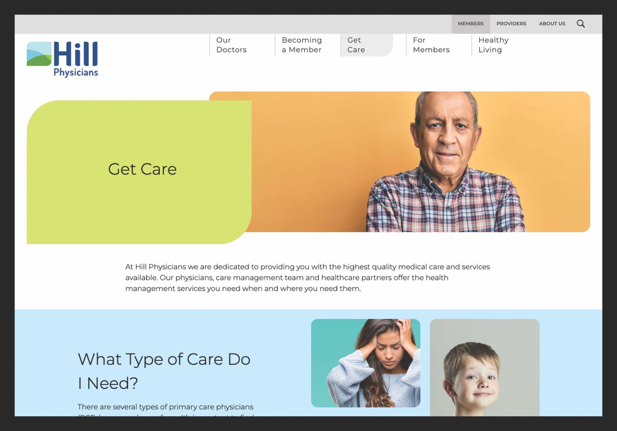
After an audience analysis, our team created separate areas for each of Hill’s primary audience—its physicians and its current/potential members. We refreshed key brand elements and applied them consistently to a modular design that enabled custom layouts on every page. We redesigned the Physicians Directory tool to offer users more information about doctors at a glance and added a user-friendly interactive map to its search features. An open-source platform was chosen to provide Hill Physicians with a responsive website that was accessible, SEO-friendly, and easy to manage.
An Intuitive Site—For the Client, and Their Constituents
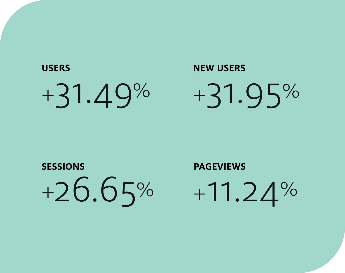
The new Hill Physicians website now messages more effectively to each of its audiences to entice more prospective members to choose Hill and more physicians to join the network. Managers can quickly and easily update any page on the site and create separate advertising landing pages. Only a month after launch, the website has seen an increase in users, a decrease in bounce rate, and significant increases in both pages per session and average session duration.
See more of our work in healthcare.
recent awards
| Client | Award | Contest | Year |
|---|---|---|---|
| Maxwell/Hanrahan Foundation | Silver Award | W3 Awards | 2024 |
| Maxwell/Hanrahan Foundation | Silver Winner | Muse Awards | 2024 |
| Beere & Purves | Silver Winner | Muse Awards | 2024 |

